Bayesian Hypothesis Testing (A/B Testing)
Overview
Have you ever wondered how to compare two similar but different series of events? In this post I’m going to explain one way of doing so using Bayesian Probability. In concrete, using the Beta Distribution.
These series of different events can be more precisely named tests or tests of hypothesis.
The first part is to formulate or shape your information into the form of total observation count, and total desired observation count. Then decide if there is any prior knowledge of the likely hood of the events occurring. This part is especially important if we have a very small amount of observations.
The beta distribution allows us to plot our all possible probabilities of a combination of observed events vs desired observed events.
To make this post easier to write and read, I am going to introduce a simple example. Imagine you are running an advertising campaign which people see (impressions) and hopefully someone clicks on (clicks). You can shape this data into impressions as total observations count and clicks as total desired observation count.
So, you run the campaign (CA) and get back some values, 10000 impressions and 10 clicks. You make some adjustments and run another campaign (CB) and get back 10000 impressions and 20 clicks.
Now let us analyse the data.
A naive way would be to say that 100/40000 = 0.0025 and 200/35400 = 0.0056, and that CB is better than CA.
Is it possible to get more out of the data? The answer is yes. Firstly, you can create a continuous distribution of probabilities for each test, and then use a montecarlo simulation technique to test which test is more likely than the other. Along the way we can discover which values are more likely for each test and how much more likely one is than the other.
In this post I will use R and it’s Mosaic.
Part one: The Continuous Beta Distribution
The Beta distribution probability density function (PDF) can output the event density around a probability x, and it is possible to make a graph of each density between the probability of 0 to 1. Probabilities with a higher density are more likely than probabilities with lower densities.
What does this density represent? Density can be thought of a percentage of how many events are packed at a certain probability. Alone the density doesn’t say much, but summing up densities give us the probability of probabilities, or said in other words the likely hood of a probability occurring.
What is a continuous function and why use it?
The real world is represented by continuous and discrete events. Things like number of coffees in the morning, wheels on my car are all discrete, while things like volume of a liquid, velocity, distance traveled, and uncertainty, chance, temperature are continuous events. A clear way to grasp this is to think of zooming into an event’s details. With discrete there is no zoomin in, one is one, two is two and so on. With continuous events you can zoom into precision infinitely, 0.000001 degrees can always be divided by 10 infinitely, and the distance between one and one could be made 0.01 by taking one as 0.99 and the other one as 0.98, there is no end to high fine we can go, it is continuous.
A continuous function can represent an infinitely number of changes with infinite precision. We can fan out all of the possible events for each probability with an infinite precision which forms a density, and then sum up these densities into a discrete count using integration.
This is a powerful tool, and allows us to compare the likely hood of probabilities for events.
Part two: Back to measuring
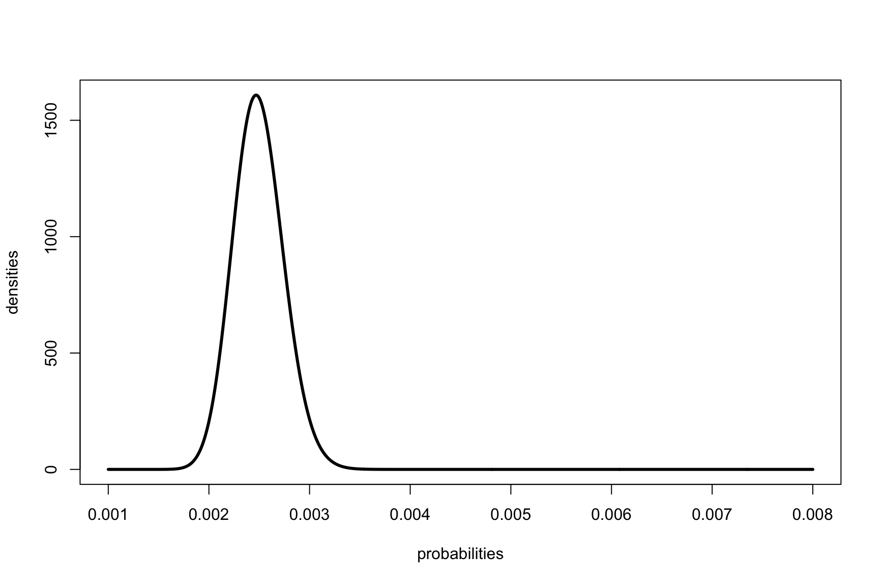
The dbeta function prints out the probability density for x. To create a graph that we can see, we need to:
- generate a list of probabilities,
- and apply the dbeta function to each value to get the densities,
- then plot out the probabilities on the x axis and the densities on the y axis.
Plotting test CA
1
2
3
probabilities <- seq(0.001, 0.008, by=0.00001)
densities <- dbeta(probabilities, 100, 40000)
plot(probabilities, densities, type='l', lwd=3)

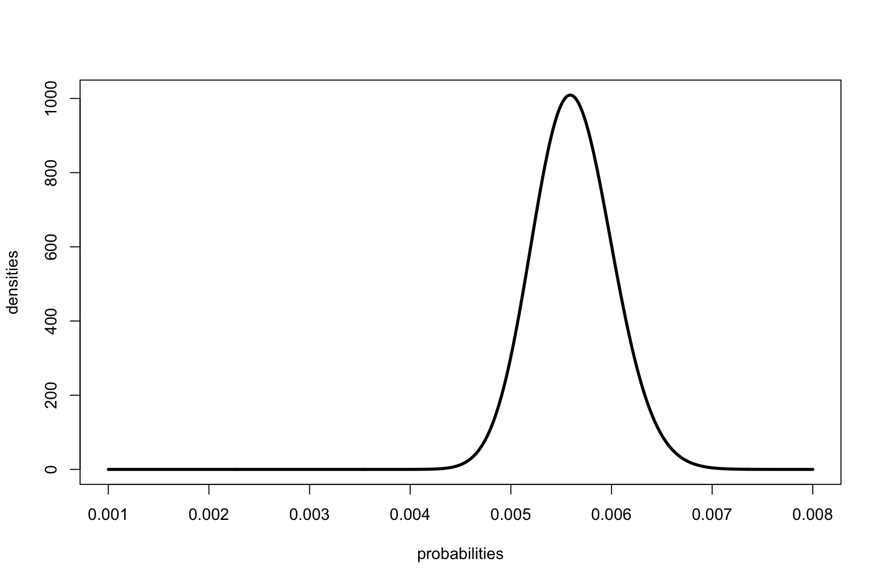
Plotting test CB
1
2
3
probabilities <- seq(0.001, 0.008, by=0.00001)
densities <- dbeta(probabilities, 200, 35400)
plot(probabilities, densities, type='l', lwd=3)

This alone however is not enough to decide which test performed better, if at all. What would be useful is to know how, based on the data for each test, how more likely is test CA vs test CB. Do to so we need to use something called a Monte Carlo simulation, which will run many tests and for each test see which event is more likely to lie in CA’s or in CB’s distribution.
What is a Monte Carlo simulation?
This is a fancy word for saying you want to randomly select data from a distribution (trials), and using the law of large numbers, you know that the more trials run, the more the expected result approaches the real value.
Using a Monte Carlo simulation allows us to go from a continuous distribution of infinite possibilities, to discrete numbers that we can compare. Why not just use discrete numbers in the first place? If we did discrete numbers in the first place we wouldn’t be able to randomly select from a large enough sample set and then we would not be able to make use of the law of large numbers.
Let’s lay out the problem: You want to know compare the result from CA and CB campaign tests. To do so, you created a Beta distribution representing all probabilities and their densities for each test.
Know is it possible to compare the two distributions by performing a series of random trials and compare how many events were in the CA Beta distribution vs the CB Beta distribution. Fortunately R has a function that will do this for us called rbeta.
Plugin in the data you get:
1
2
3
4
5
6
trials <- 100000
ca_samples = rbeta(trials, 10, 40000)
cb_samples = rbeta(trials, 20, 35400)

result <- sum( cb_samples > ca_samples  ) / trials
0.98642
The result means that over all the trials 0.98642 percent of the time CB was better.
Using a histogram, you can also answer the question of, how many times is CB better than CA
1
hist(cb_samples/ca_samples, breaks = 20, col = 'blue', border = 'black', main = '', xlab = 'Ratio', ylab = 'Frequency')
Appendix A
Using R
1
2
3
4
xs <- seq(0, 0.006, by=0.00001)
plot(xs, dbeta(xs, 10, 9990), type='l', lwd=3)

plot(xs, dbeta(xs, 20, 9980), type='l', lwd=3)